This Week's Sponsor:

Kolide

Ensure that if a device isn’t secure it can’t access your apps.  It’s Device Trust for Okta.


Search results for "iOS "The MacStories Review""

macOS Ventura: The MacStories Review

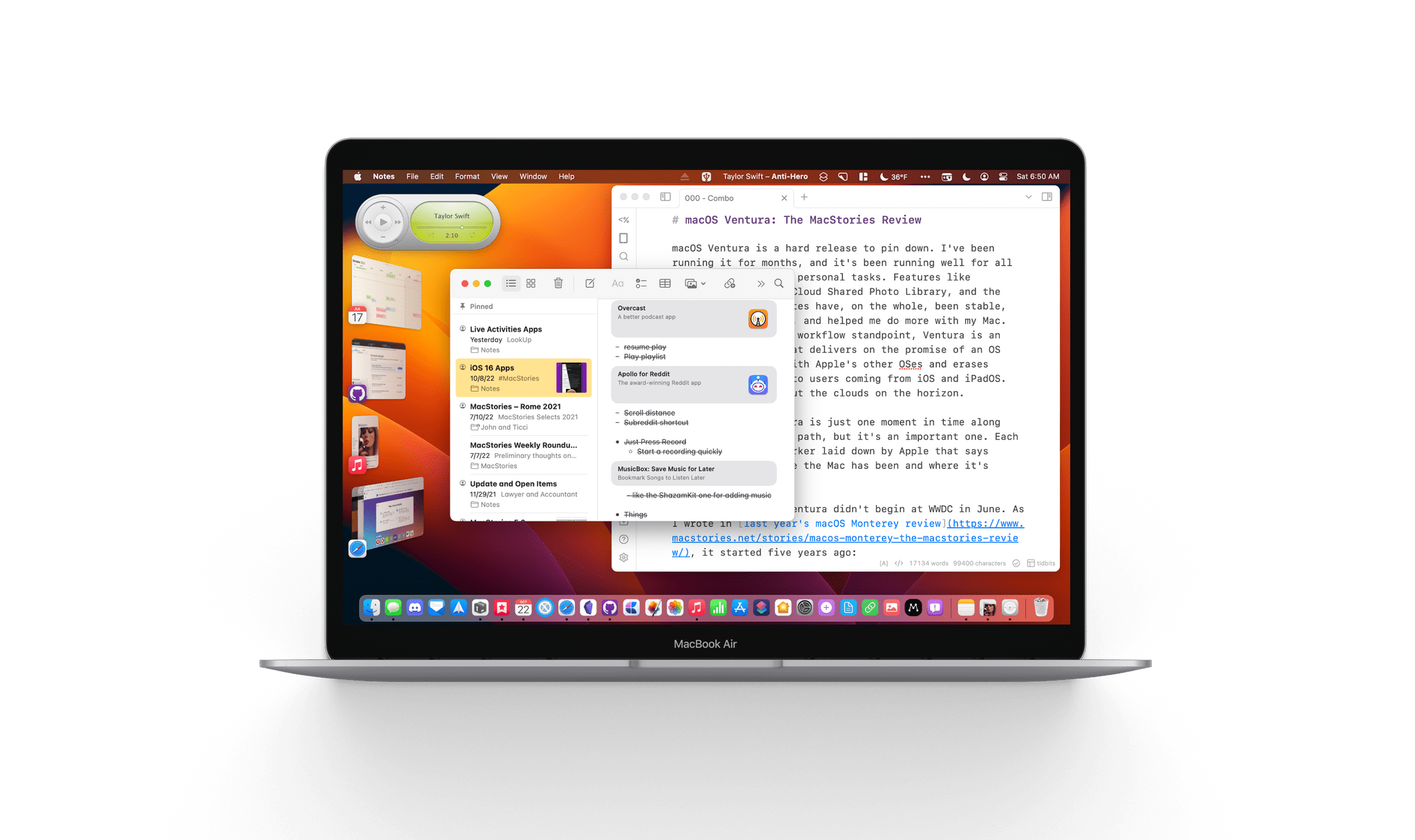
macOS Ventura is a hard release to pin down. I’ve been running it for months, and it’s been running well for all my everyday work and personal tasks. Features like Continuity Camera, iCloud Shared Photo Library, and the many system app updates have, on the whole, been stable, worked as advertised, and helped me do more with my Mac. So, from an everyday workflow standpoint, Ventura is an excellent release that delivers on the promise of an OS that moves in step with Apple’s other OSes and erases artificial barriers to users coming from iOS and iPadOS. And yet, I worry about the clouds on the horizon.

The release of Ventura is just one moment in time along macOS’s evolutionary path, but it’s an important one. Each fall release is a marker laid down by Apple that says something about where the Mac has been and where it’s going.

The story of macOS Ventura didn’t begin at WWDC in June. As I wrote in last year’s macOS Monterey review, it started five years ago:

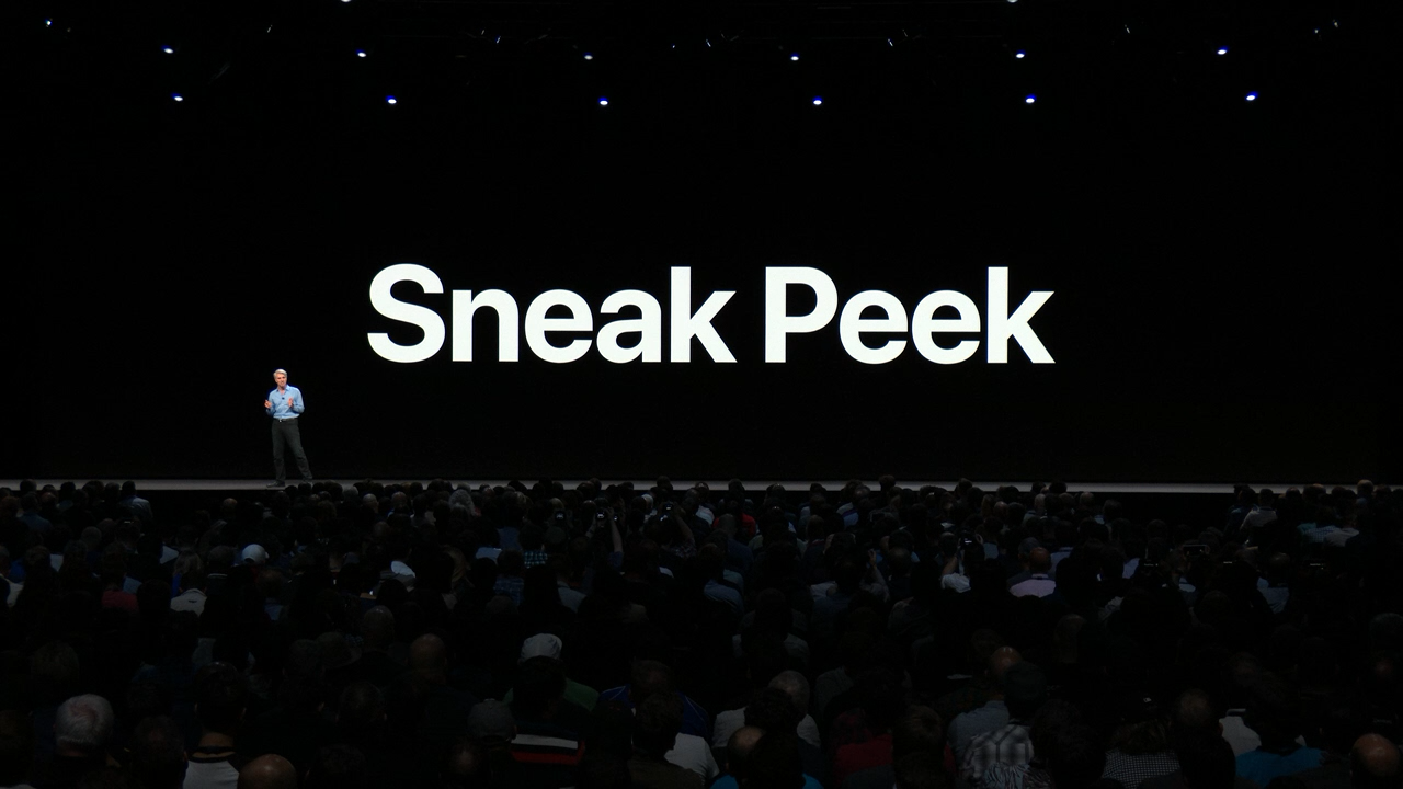
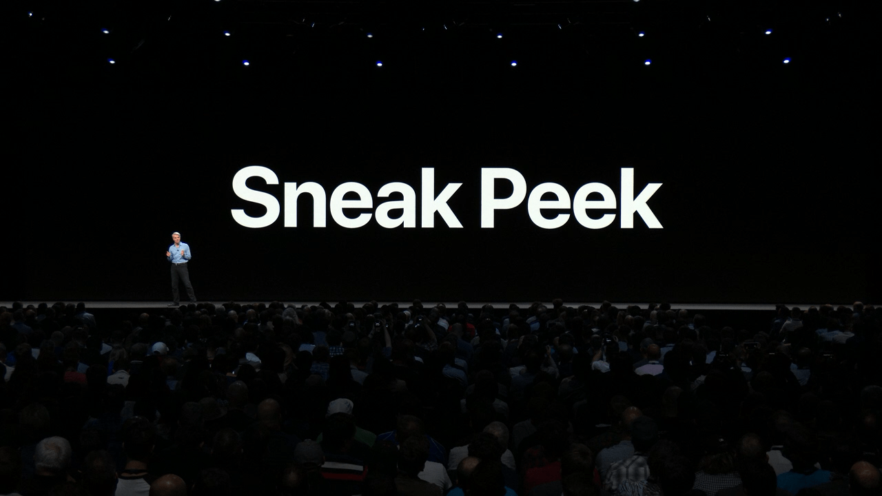
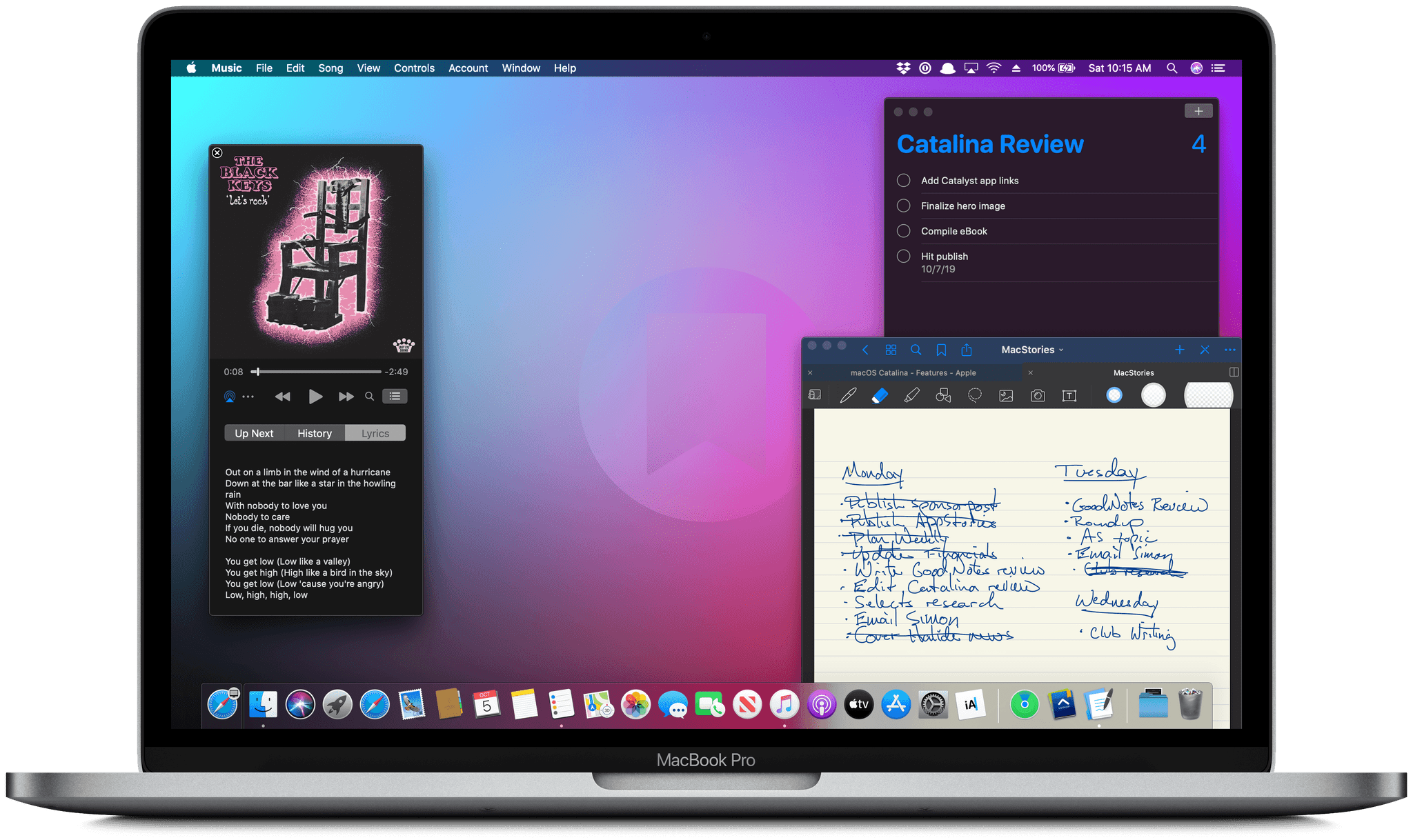
For the past few years, no narrative thread has been more important to the Mac and its operating system than their realignment within Apple’s product lineup. It’s a fundamental transformation of both hardware and software that has taken shape over years, beginning publicly with Craig Federighi’s WWDC Sneak Peek in 2018.

Before Mac Catalyst, there was Craig Federighi's 2018 Sneak Peek.

Before Mac Catalyst, there was Craig Federighi’s 2018 Sneak Peek.

Last year’s release of Monterey went a long way toward validating what came before with Catalina and Big Sur:

Monterey is one of the most tangible, user-facing payoffs of the past three years of transition. More than ever before, Apple is advancing system apps across all of its platforms at the same time. Finally, everything is everywhere.

Ventura is, in many ways, a continuation of Monterey’s storyline. Apple has delivered a second year of parallel development across its system apps, with the notable exception of Shortcuts, which I’ll cover later. That’s a big win for Mac users who, in previous years, waited multiple releases for apps like Maps and Books to catch up with their iOS and iPadOS counterparts.
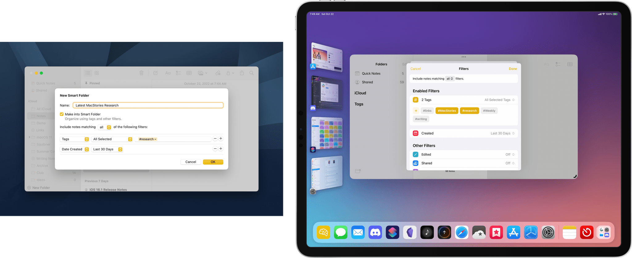
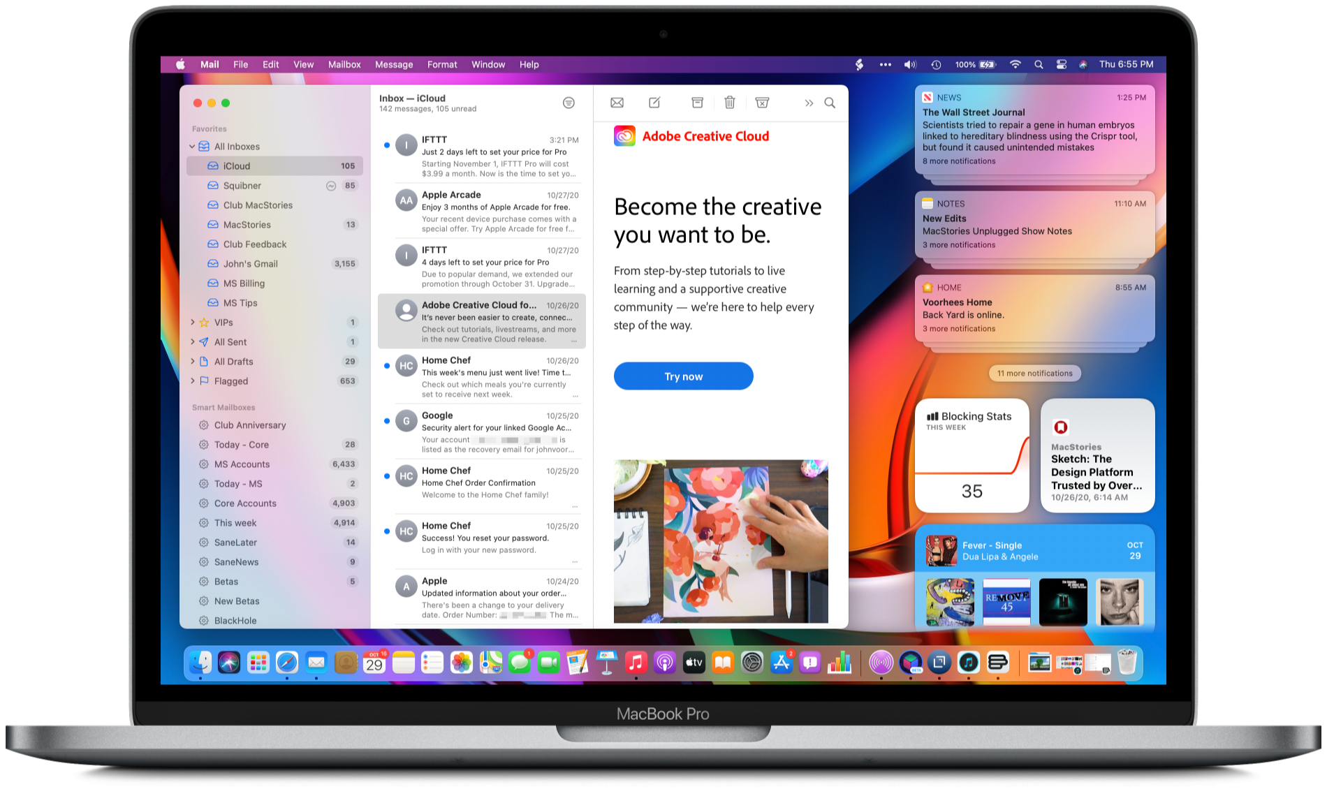
The familiar interface and feature set across multiple platforms are one of the biggest and most tangible achievements of the past few years.

The familiar interface and feature set across multiple platforms are one of the biggest and most tangible achievements of the past few years.

So, with Monterey’s success of moving system apps forward in unison across all OSes looking more like a trend than a one-off novelty, what are the clouds I’m seeing on the horizon? There are three:

  • Stage Manager: Stage Manager is in far better technical shape on the Mac than on the iPad. In fact, I’ve been using it every day since WWDC and will continue to do so. There’s lots of room for improvement, which I’ll cover below, but my concern extends beyond the Mac-specific issues to what the feature’s problems on the iPad mean for Mac users long-term, which is something I covered last month for Club MacStories members and will expand on below.
  • Shortcuts: Shortcuts was in rough shape when it launched on the Mac last year. The app is in a much better place today, although bugs continue to be a problem. More concerning to me, though, is the lack of new system-level actions on the Mac. A lot of resources undoubtedly went into stabilizing Shortcuts on the Mac over the past year, which is understandable, but unfortunately, those efforts seem to have been at the expense of introducing new system-level actions or maintaining parity with new actions on iOS and iPadOS.
  • System Settings: So much of the design work we saw introduced with Big Sur was so carefully considered to harmonize macOS with iPadOS while retaining its Mac nature that System Settings is a shock to, well, the system. System Preferences was long overdue for a refresh, but System Settings isn’t the redesign we needed. Instead, it’s a clear example of why you can’t just graft iOS or iPadOS design onto macOS and call it quits.

Although each of the items above concerns me, it’s equally important to put them in context. For most users, macOS is in a very good place. My day-to-day work on the Mac isn’t affected by whether the iPadOS version of Stage Manager is buggy. I may feel constrained by the lack of some actions in Shortcuts on my Mac, but at the same time, I’ve got Shortcuts on the Mac, something I’d hoped for for years. And Systems Settings are, after all, just settings that may not be great to look at, but they still work.

However, while the issues with Ventura may not be immediate, they’re still important because they threaten the viability of the Mac in the midst of its hardware renaissance. I want to see the Mac continue to grow and flourish, and I’m convinced more than ever that aligning it and the iPad is one of the ways to accomplish that. Unfortunately, Ventura doesn’t move that ball forward in a meaningful way.
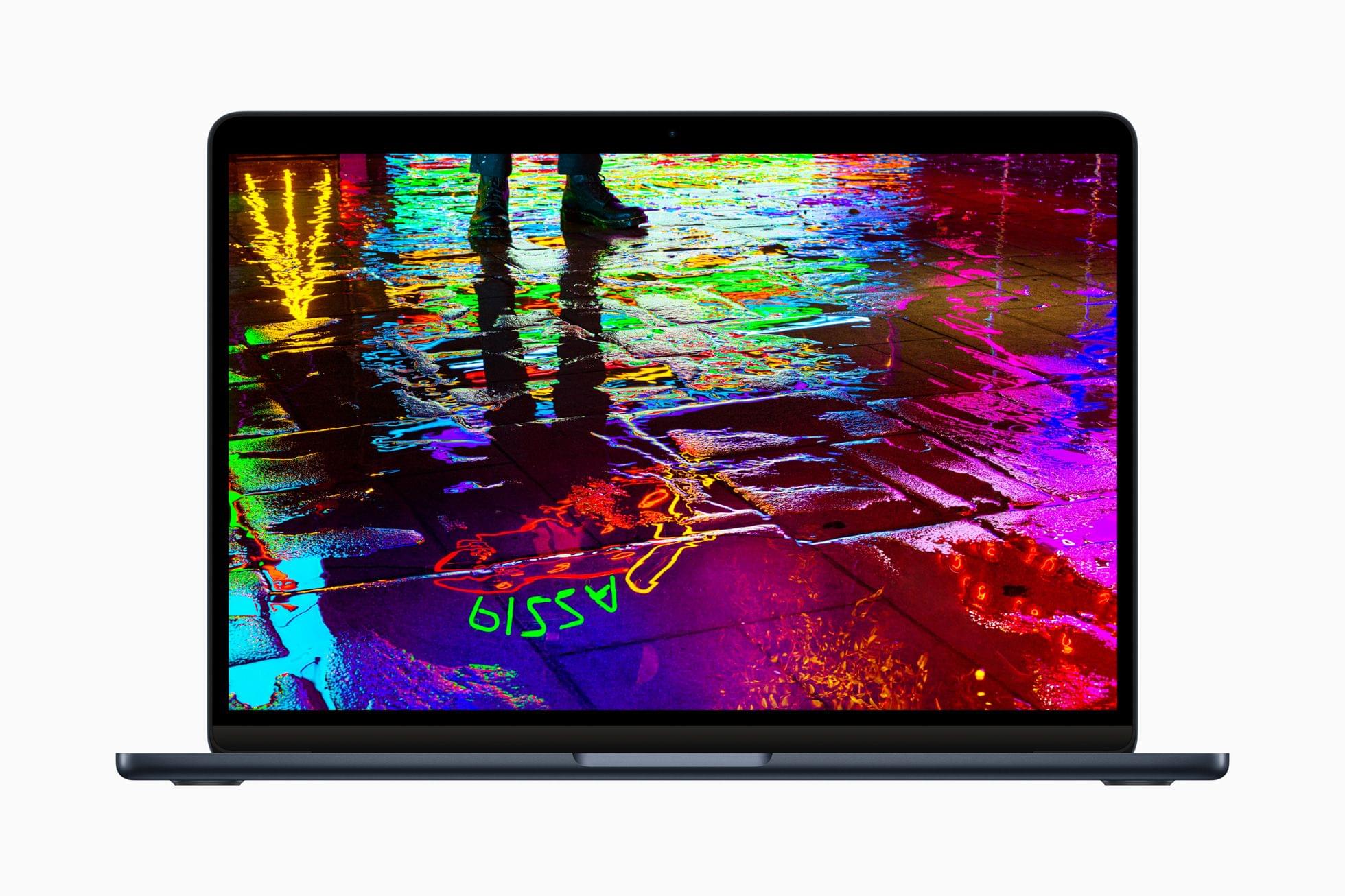
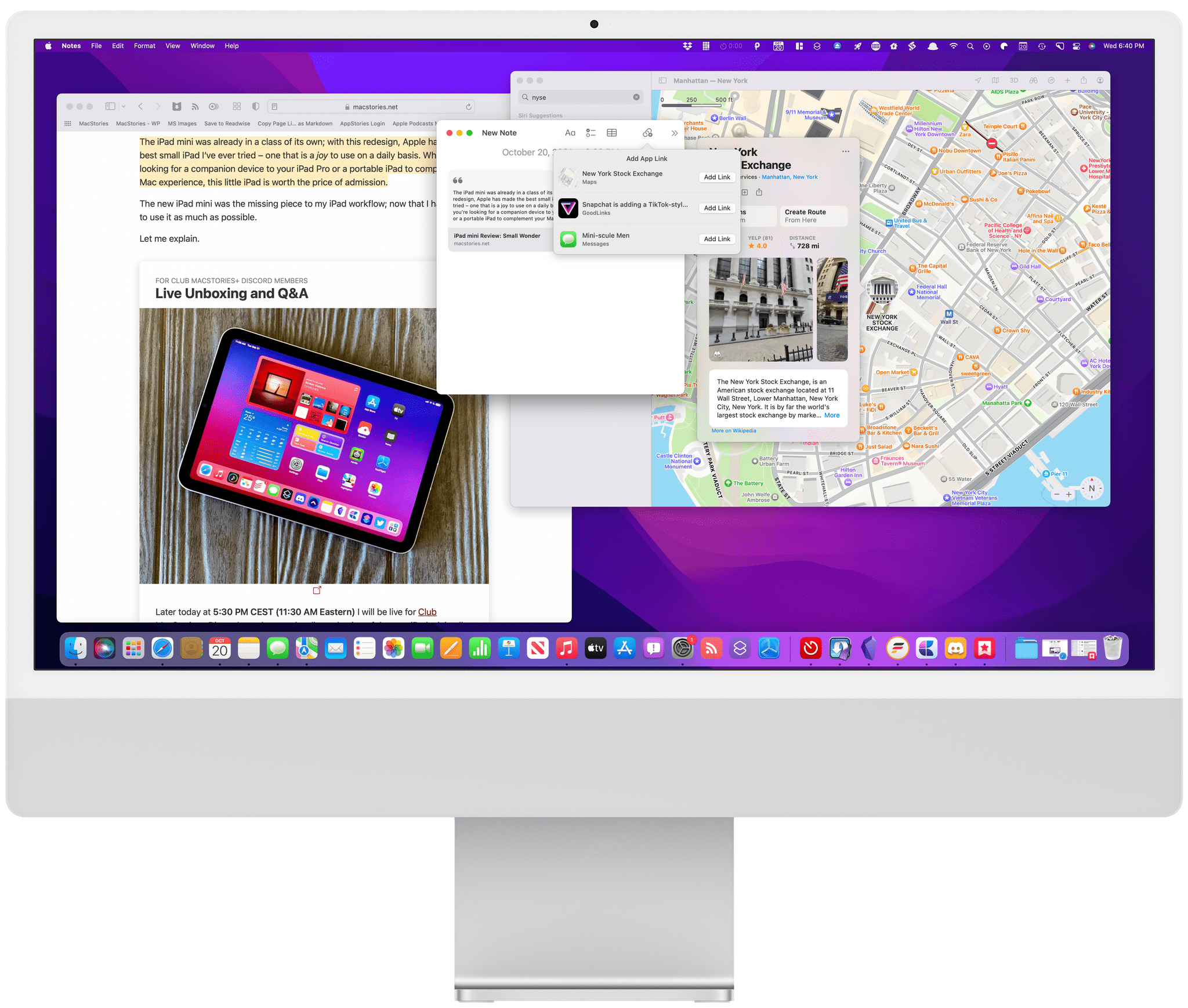
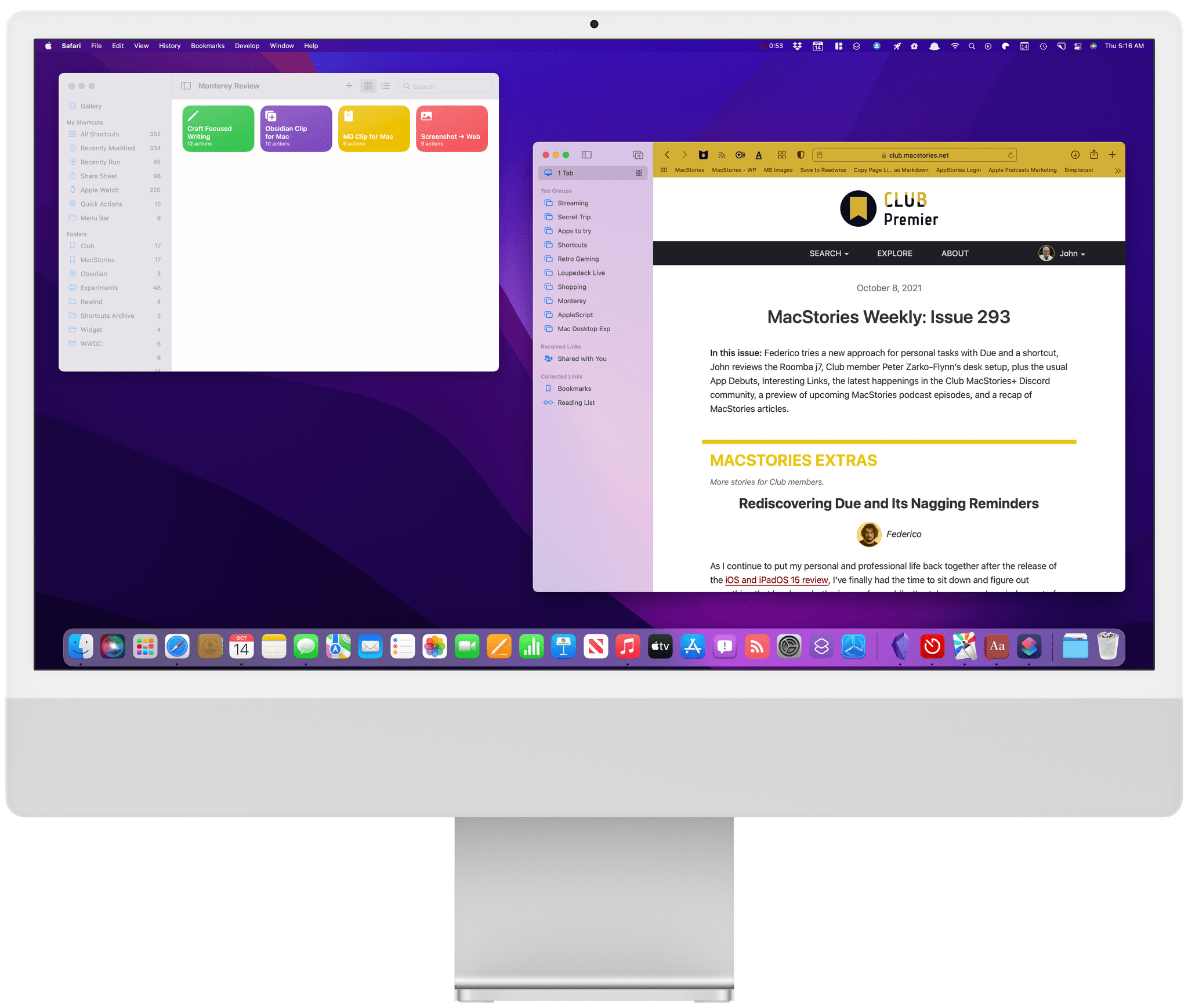
With Apple firing on all cylinders when it comes to hardware, now is no time to let macOS stall. Source: Apple.

With Apple firing on all cylinders when it comes to hardware, now is no time to let macOS stall. Source: Apple.

By tying the two together, Apple has set the stage for a healthier third-party app ecosystem that benefits both platforms by making it more economical for developers to create apps for both. I’m sent a lot of apps to try, and I can tell you that this is absolutely happening already. The vast majority of the apps I’m sent today aren’t Mac-only or iPad-only – they’re universal apps that work on both and usually the iPhone and Apple Watch too.

However, the work and the story that started with Federighi’s Sneak Peek aren’t finished. For the Mac and iPad to thrive, now is not the time for Apple to take its foot off the gas. Yet, that’s what Ventura feels like after several years of foundational changes to macOS. It’s not a bad update. There’s a lot to like among the system apps and other changes, but I can’t shake the nagging sense that Apple has taken its eye off the long-term vision for macOS with Ventura. That won’t affect your day-to-day use of the OS, but it’s certainly something worth keeping a close eye on as Ventura is updated and WWDC rolls around again next summer.

Read more


watchOS 9: The MacStories Review

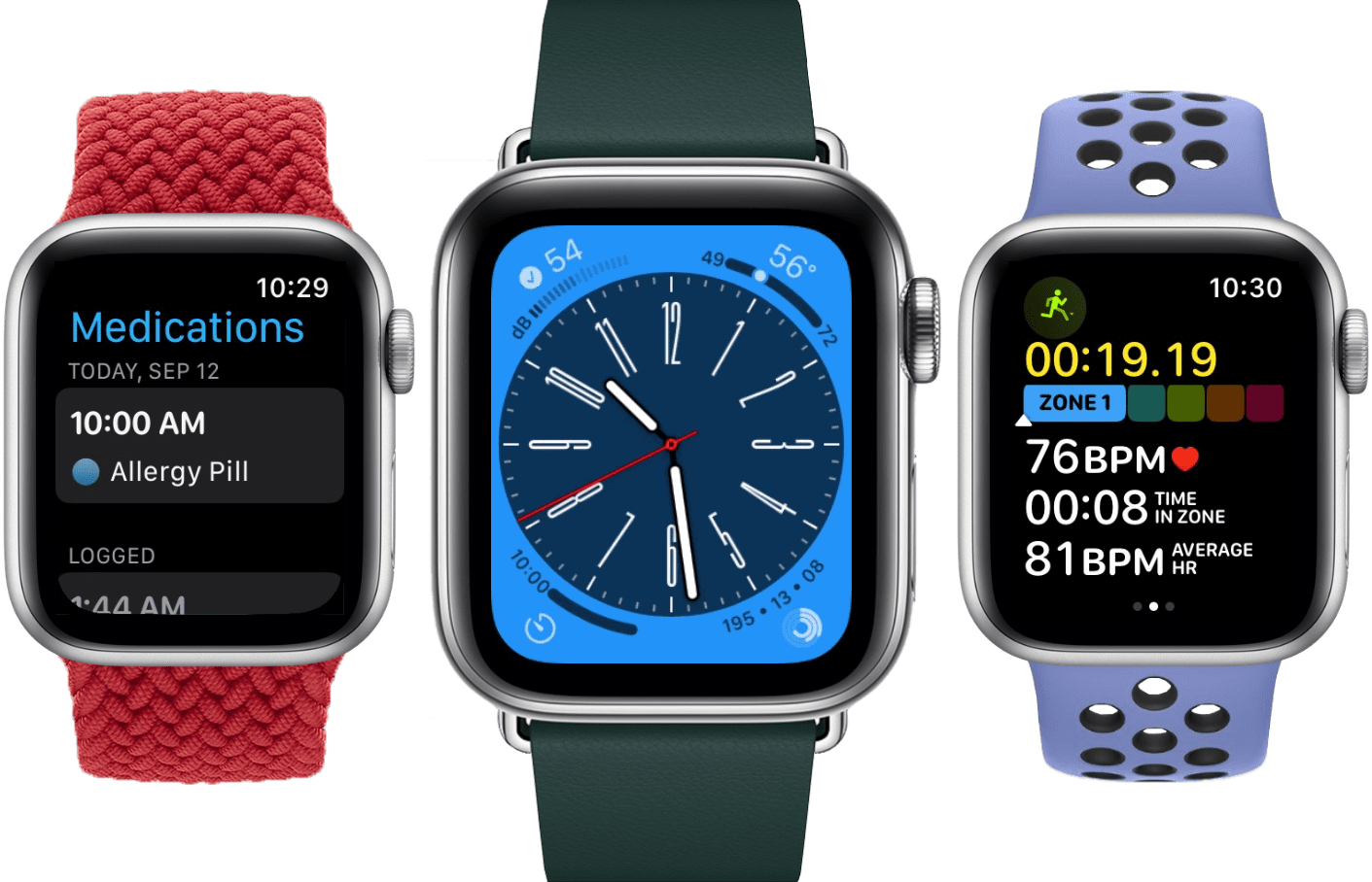
As we enter the ninth iteration of watchOS, I must admit that I sometimes find myself looking back wistfully on the computer watch that the Apple Watch once was. My inner tech nerd misses the wild, blind shots at digital connection and interface design which we were gifted by an Apple that had not yet figured out what the mass market wanted from this device.

In many ways, the early days of the Apple Watch feel like echoes from a bygone era of Apple; an era in which it was more willing to throw things at the wall just to see what stuck. This is, after all, the company which brought us the buttonless iPod shuffle, the hockey puck mouse, brushed metal, the tape-recorder Podcast app, and so much more. We tend to call it Apple’s sense of “whimsy”, and early watchOS had plenty of it.

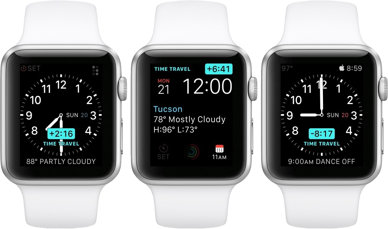
Time Traveling in watchOS 2.

Time Traveling in watchOS 2.

In watchOS 2, Apple shipped a feature called Time Travel where you could spin the Digital Crown to “travel backwards and forwards in time”. Complications would move alongside the watch hands to reflect their past or predicted future values. Time Travel was demoted to a setting in watchOS 3, and quietly removed entirely some time later.

There was also the concept of Glances beginning all the way back in watchOS 1. Glances were single-page app interfaces accessible by swiping up from the watch face, then swiping side-to-side to switch between them. Third-party apps could create these, and the watch supported up to 20 of them. Glances were also canned in watchOS 3. They were replaced by the Dock, which never quite managed to capture the same energy.

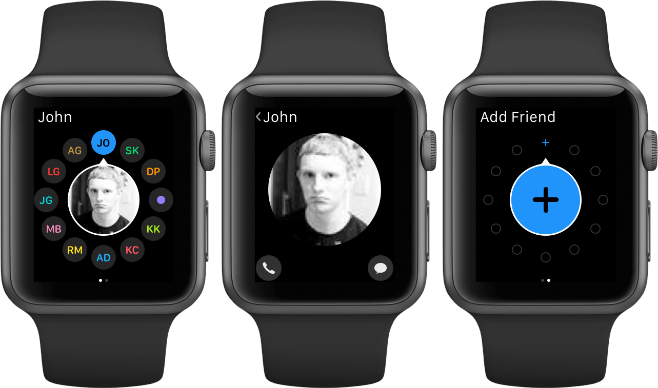
For years, Apple seemed particularly interested in the potential of the Apple Watch to be a core hub for personal communication. Until watchOS 3, the hardware side button on the device was dedicated to opening the Friends interface. When interacting with your friends, you could send giant animated emojis — perhaps a very early precursor to the Memoji that we have today. And of course, no one could forget Digital Touch. Who among us did not feel more connected to our loved ones when tapping out pings and drawing shapes on their wrists1?

The Friends interface in watchOS 2.

The Friends interface in watchOS 2.

What leaves me feeling so conflicted is that, ultimately, all of the above features were pretty bad. No one used the Friends interface, Time Travel wasn’t particularly useful, third-party Glances were kneecapped by their lack of interactivity, and communicating from an Apple Watch has always just been way more work than pulling out your iPhone. Apple was right to kill all of these features in their time, but I still can’t stop missing the days when my Apple Watch was searching for more variety in purpose than it exists with today.

Read more


  1. I imagine Digital Touch is unfazed by my mockery; likely too busy feeling satisfied that it is the only one of the features described above which has (somehow) endured into modern iterations of watchOS. ↩︎

iOS 16 Review Extras: eBooks, Shortcuts, Making Of, and an Obsidian Plugin

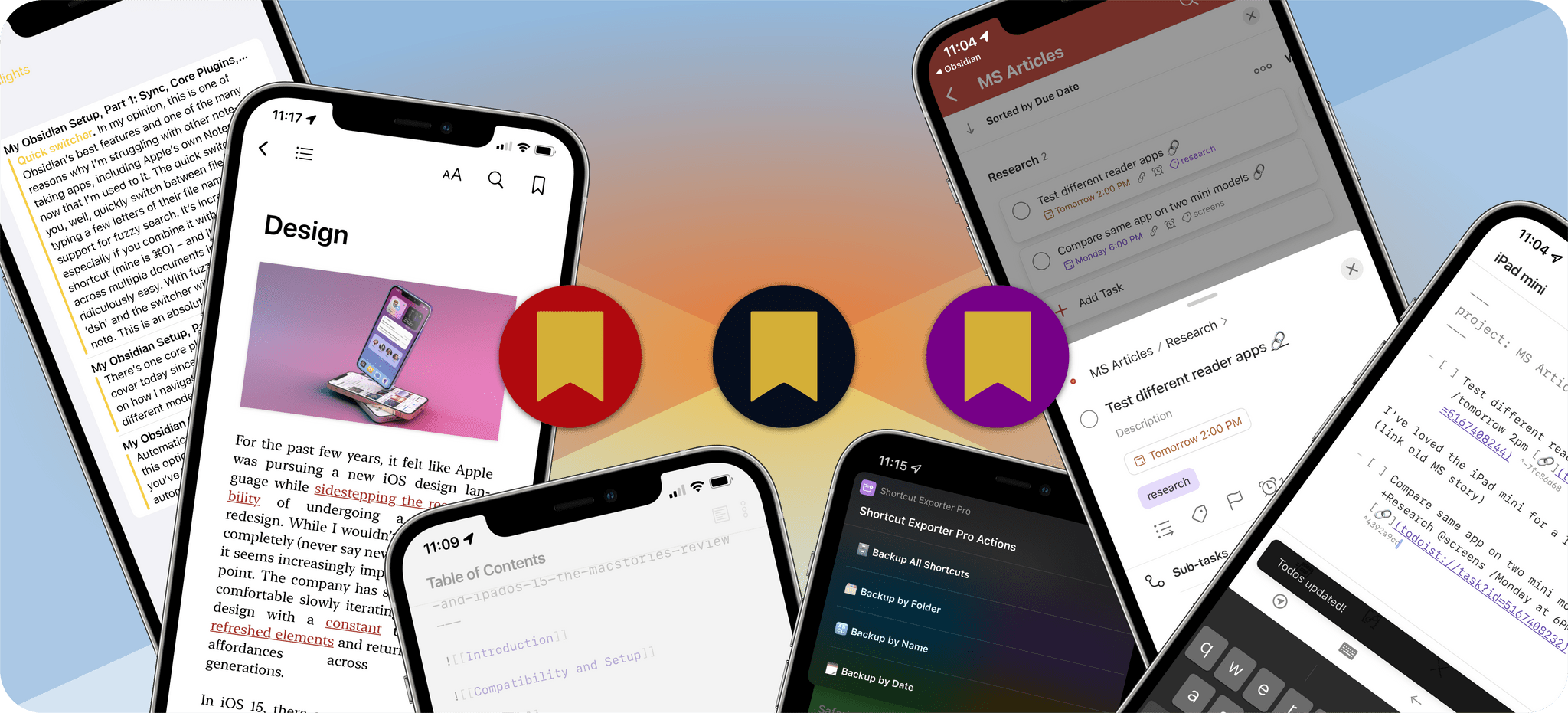
Today, Federico published his iOS 16 review. As in past years, we’re releasing a wide variety of perks exclusively for Club MacStories members throughout the week, including an eBook version of the review, an eBook compilation of our 2022 OS Preview Series, two advanced shortcuts, two behind-the-scenes making of the review stories, and an update to one of our Club-exclusive Obsidian plugin.

What’s more, because Apple won’t be releasing iPadOS 16 until later this fall, we’ll have more perks for Club members when it’s released too.

Read more


MacStories Unwind: macOS Monterey and iOS and iPadOS 15.1 Are Here, Plus Shortcuts for Mac, and a MacBook Pro Review

0:00
26:53


Sponsored by: Daylite – It’s Monterey Ready!

This week on MacStories Unwind:

MacStories

Club MacStories

  • MacStories Weekly
    • A collection of John’s favorite XL widgets
    • Federico on the gap between Apple system apps and their Shortcuts actions
    • An all-new MacStories Unplugged that take a behind-the-scenes look at the making of John’s macOS Monterey review.

AppStories

Unwind


macOS Monterey: The MacStories Review

OSes are never truly finished. macOS has been continuously evolving for decades, and it would be foolhardy to declare it ‘finished’ in any sense of the word. It’s not.

However, when you step back and look at macOS over time, trends and storylines emerge from the feature list minutiae of each release. For the past few years, no narrative thread has been more important to the Mac and its operating system than their realignment within Apple’s product lineup. It’s a fundamental transformation of both hardware and software that has taken shape over years, beginning publicly with Craig Federighi’s WWDC Sneak Peek in 2018.

The story begins with a Sneak Peek at the end of a WWDC keynote in 2018.

The story begins with a Sneak Peek at the end of a WWDC keynote in 2018.

A parallel story has been playing out with the iPad’s hardware and OS. The iPad’s trajectory has been different than the Mac’s, but today, we find ourselves with two distinct but more closely aligned platforms than ever before. To get there, the iPad has grown into a powerful, modular computer, while the latest Macs now run on the same processor architecture as the iPad Pro and no longer work differently in places just because that’s the way it’s always been.

The journey hasn’t always been easy, especially in the wake of questions about Apple’s commitment to the Mac. The company took those concerns head-on in an unusual meeting with a handful of tech writers in 2017. Still, it was only natural for users to question whether the direction macOS was heading was the correct one.

It didn’t help that those first Catalyst apps that were part of the 2018 Sneak Peek – Home, News, Stocks, and Voice Memos – were rough around the edges and a departure from long-held beliefs about what constitutes a great Mac app. The Mac’s apps had historically been held out as a shining example of the kind of user experiences and designs to which developers who cared about their apps could aspire. Unfortunately, many early Mac Catalyst apps weren’t very inspiring.

The realignment has been rocky for iPad users, too, especially for iPad Pro uses. The Pro’s hardware has been infrequently updated, and the performance of the Apple silicon processors they’ve run on has outpaced what the apps on the platform can do.

Users’ fears have also been fueled by Apple’s institutional secrecy and the multi-year scope of the company’s undertaking. Early communications about Mac Catalyst and SwiftUI left developers and observers confused about the role of each. The situation is more clear today, but at the same time, the question of how to approach building a Mac app is best answered with ‘it depends.’ That isn’t a very satisfying answer. Nor does it help that despite the added clarity, technologies like SwiftUI still have a long way to go to reach their full potential.

Catalina was full of promise, but the road ahead was unclear.

Catalina was full of promise, but the road ahead was unclear.

Yet despite the bumps along the road, macOS has made great strides since that 2018 Sneak Peek. With Catalina, we saw the first steps down a path that pointed the Mac in a new direction. Although sometimes messy, the promise of Catalina was exciting because, as I concluded in that review:

There’s no greater threat to the Mac than resistance to change that exists not because the change is worse, but because it’s different.

Catalina was a counter-strike against the sort of inertia that would have doomed macOS eventually, even though at the time, it was more a promise than a destination.

Big Sur's design changes brought the direction of macOS into sharper focus.

Big Sur’s design changes brought the direction of macOS into sharper focus.

Big Sur picked up where Catalina left off, adjusting course and clarifying where macOS was heading. The update continued the harmonization of user experiences across Apple’s entire lineup, creating a more natural continuum among the company’s products through new design language and updated system apps without abandoning what makes the Mac unique. I don’t mean to suggest that Catalina or Big Sur were unmitigated successes. They weren’t, and some of the missteps of those releases have yet to be addressed, but there was no mistaking where macOS was headed after the release of Big Sur.

Monterey harmonizes system app updates across all of Apple's platforms.

Monterey harmonizes system app updates across all of Apple’s platforms.

Monterey’s focus is all about system apps, a topic near and dear to me. With the technical building blocks in place and a refined design out of the way, Monterey is one of the most tangible, user-facing payoffs of the past three years of transition. More than ever before, Apple is advancing system apps across all of its platforms at the same time. Finally, everything is everywhere.

However, as much as it pleases me to see the groundwork laid in years past pay dividends in the form of new features being rolled out simultaneously on all platforms, Monterey’s payoff isn’t an unqualified success. Every OS release has its rough spots, but this year, Shortcuts is especially rough. As optimistic and excited as I remain for Shortcuts to be the future of automation on the Mac, it’s too frustrating to use at launch. That’s not to say I haven’t enjoyed any upside using Shortcuts on my Mac, and it has improved over the course of the beta period, but it still gets in my way more often than it should.

Alright, that’s enough looking back. Let’s dig in and see where things work, where they don’t, and what lies ahead when you install macOS Monterey.

Read more


MacStories Unwind: iOS and iPadOS 15, the iPad Mini, and iPhone Camera Reviews

0:00
20:04


Sponsored by: DetailsPro – A Design Tool Made for SwiftUI

This week on MacStories Unwind:

MacStories

Club MacStories

  • MacStories Weekly
    • Coming Saturday:
      • The ‘Making Of’ Federico’s iOS and iPadOS 15 review
      • Two Club-only advanced shortcuts
      • Lots of app coverage

AppStories

Unwind


watchOS 8: The MacStories Review

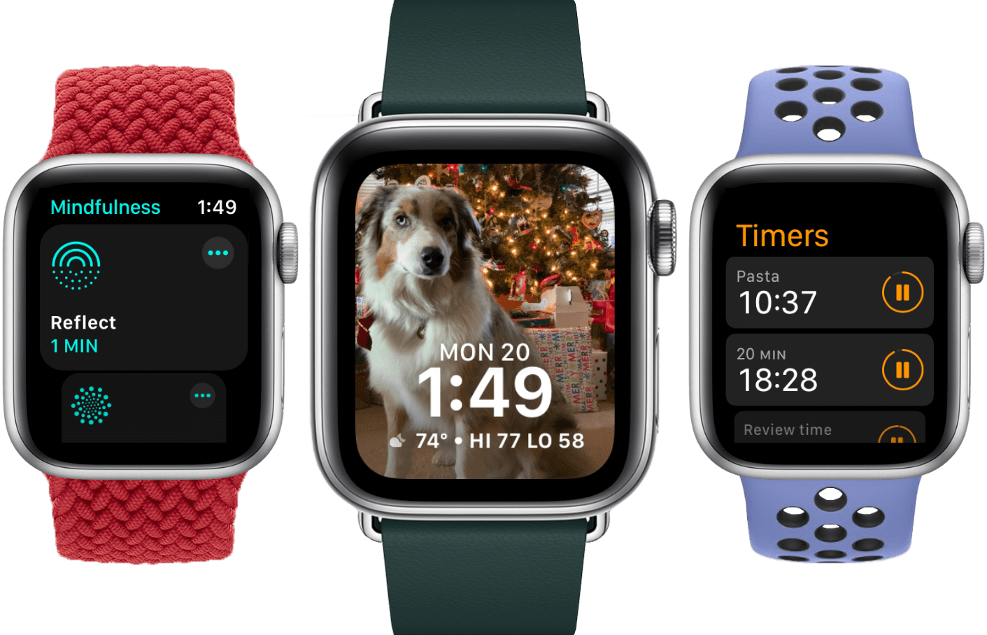
We’ve come a long way from the Wild West of watchOS’ early versions. Changes in recent years have been thoroughly iterative in nature, suggesting that Apple believes that the platform has reached maturity. watchOS 8 heralds no deviation from this path, but as usual, a host of features bring new minor excitements for us to explore.

Health and fitness are established pinnacles of any good watchOS update, and this year’s offerings include a new Mindfulness app, sleep tracking improvements, and expanded workout types. Since Complications can now communicate with Bluetooth devices, health and fitness data from Bluetooth accessories will be more accessible than ever.

The usual host of first-party app updates are back this year too, with Home and Timers getting the most interesting changes. As for watch faces — another common source of easy feature additions — Apple seems to have dropped that ball this time around. Only two new faces are joining the ranks, and existing faces have remained stagnant.

At the system level, text input has received some nice updates. While still a bit clunky, some of the strictest limitations have been lifted, making the Apple Watch useable in more situations where I would previously have never considered it. The always-on display in Apple Watch Series 5 and higher will be far more useful in watchOS 8 as well, as third-party apps are finally able to utilize it.

Despite a lot of tidbits scattered throughout, watchOS 8 is easily the smallest annual update in the Apple Watch’s short history. This shouldn’t be a surprise given that we’re in the second year of a global pandemic, but it still feels disappointing.

Hopefully next year Apple will devote a bit more time and effort to watchOS, but for now let’s dig into the new additions that we do have to explore. Despite the small size of watchOS 8, its features are all positive improvements, and it’s still the best iteration of the Apple Watch operating system to date.

Read more


iOS and iPadOS 15 Review Extras: eBooks, Shortcuts, Making Of, Obsidian Plugins, Safari Extension Beta, and AppStories Live

Today, Federico published his iOS and iPadOS 15 review. The review has become the centerpiece of what is always a busy fall season at MacStories. It has also become a tradition that we release a wide variety of perks exclusively for Club MacStories members alongside Federico’s review.

Read more


HoverBar Duo: The MacStories Review

There is no shortage of iPad stands. Search for one on Amazon, for instance, and you’ll be met with page after page of results. Most stands are unremarkable, with little that distinguishes one from another.

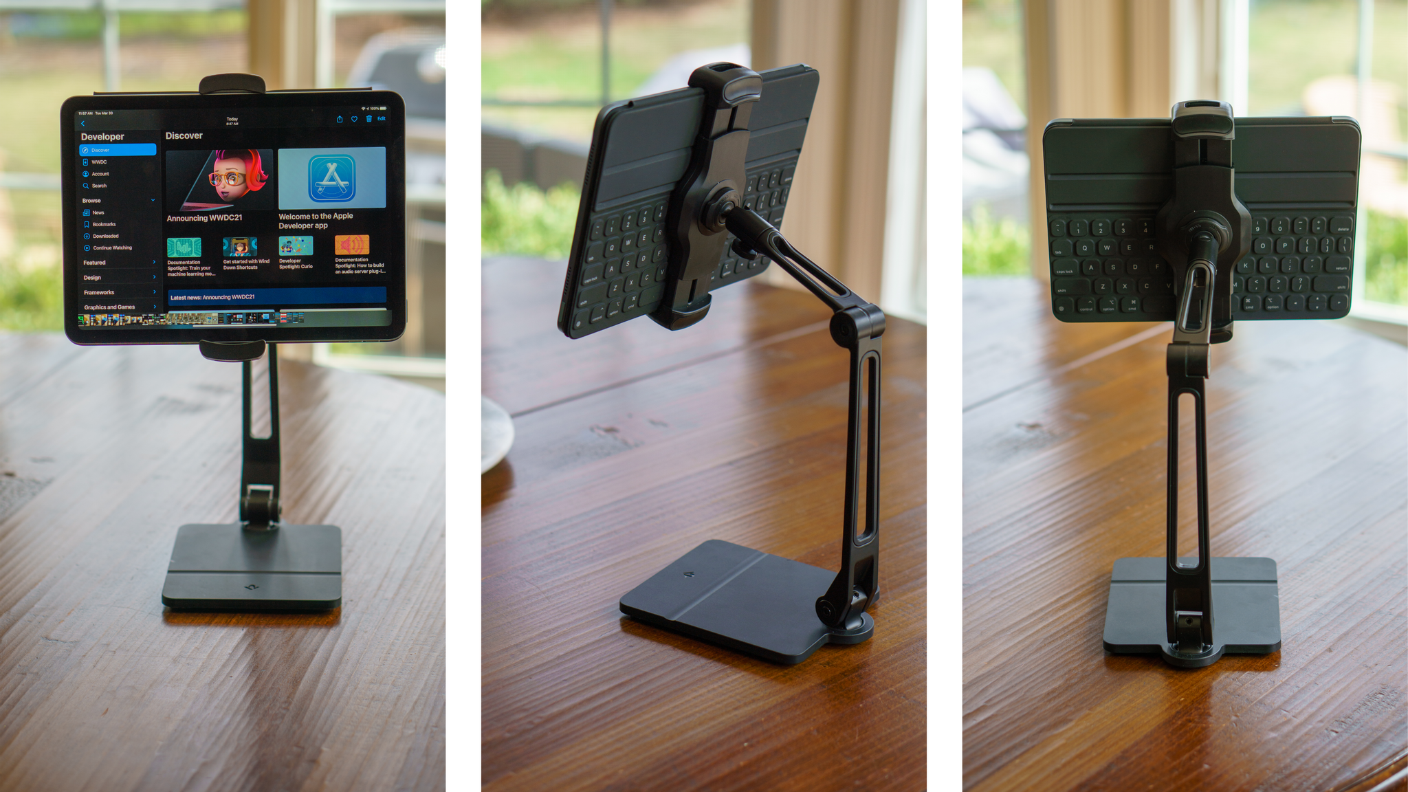
Twelve South’s HoverBar Duo is different, though. The black aluminum and plastic stand has two articulating hinges with a clamp for your iPad that connects to the stand’s arm with a ball joint. The stand also rotates side-to-side at its base. The design, which is reminiscent of an attractive, modern desk lamp, provides a broader range of motion than most stands, making it useful in more scenarios. As a result, I’ve found myself using the HoverBar Duo far more than any stand I’ve tried before.

Read more